Product
A floor planning tool people were too forgiving of.
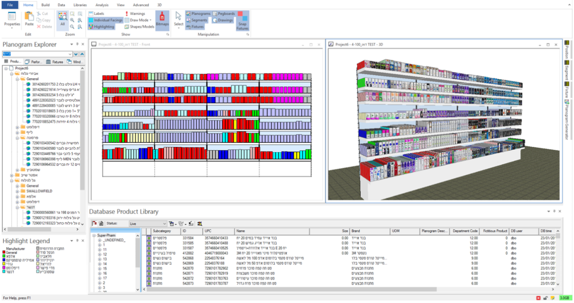
Floor planners decide how a retail store is laid out at a macro level; strategic, data-heavy work — how is space divided across sections? How much floor space does cereal get versus dairy? How does that shift seasonally? How do you plan for a new store opening?
Blue Yonder had a floor planning tool that was widely used but felt dated and slow, and didn’t match the rest of the company’s software portfolio. So users had adapted: they built their own automations, and raised tickets for missing features, accepting the friction as “just the way things worked”.
When the team decided on a full rebuild, there was no industry standard to reference. The goal was to do more than a visual refresh and to build something that set the bar for retail floor planning.
Discovery research
Users weren’t complaining because
“that’s just how the tool works.”
I interviewed 8 Blue Yonder customers (power users and new users), and 5 external floor planners who didn’t use Blue Yonder (some didn’t use a dedicated tool at all). The participants came from four countries (USA, UK, Mexico, Norway) and a range of company sizes and store formats.
When I asked what they would improve about their workflows, most participants went quiet. After probing, I found that most had stopped imagining it could be different. They couldn’t name what was wrong because they had already built habits around it.
Reframing the questions helped. “Walk me through the last time something didn’t go the way you expected” got further than “what would you improve?” That’s when the real picture came out.
Image
Discovery & Ideation Workshops
An asynchronous “workshop” before the workshops, to ensure continued progress.
After sharing my research findings, I wanted to gather stakeholders’ thoughts on what to build next. But getting everyone in the same session was harder than I expected. PMs were never all available at once, but nobody wanted to go ahead without full attendance, so the project kept stalling.
That gave me consolidated input before the meeting and let me make the session shorter and more focused.
When we did meet, I ran a Lucid board session where we voted on the async answers, collapsed overlaps, and agreed on a minimum feature set for the first release and a clear backlog for everything else.
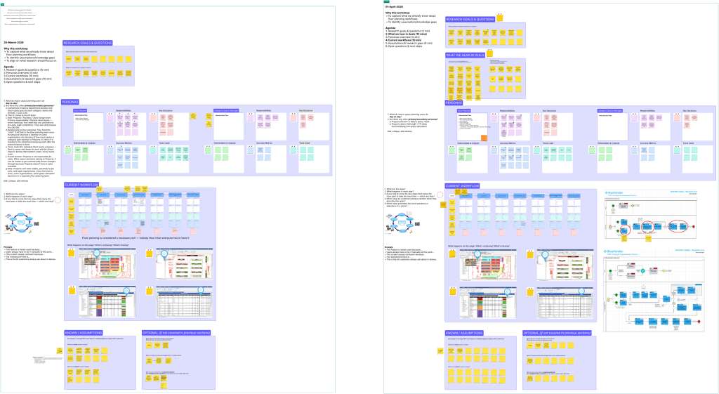
For the ideation workshop, I brought in PMs and designers, and together we brainstormed implementation ideas for the minimum feature set. Once that was done, I brought in engineers to validate feasibility.
Because this project ran long enough for priorities to drift, I maintained a regular cadence with stakeholders. I made sure the team stayed connected to customer input at every stage, not just at the start and end.
Concept testing
Users contradicted one of our main assumptions about leading with familiarity.
I ran concept testing in two rounds using the RITE method. Fixing obvious issues between sessions meant Round 2 could focus on more nuanced details, and the end-to-end flow.
Round 1, lo-fi. I tested wireframes and screenshots across different design directions, navigation flows, and scenario-based tasks for new features. For anything preference-based, I tested with every participant before committing.
Round 2, V0 prototype. I tested the full end-to-end flow, including interaction details, content, and how the new system felt to use.
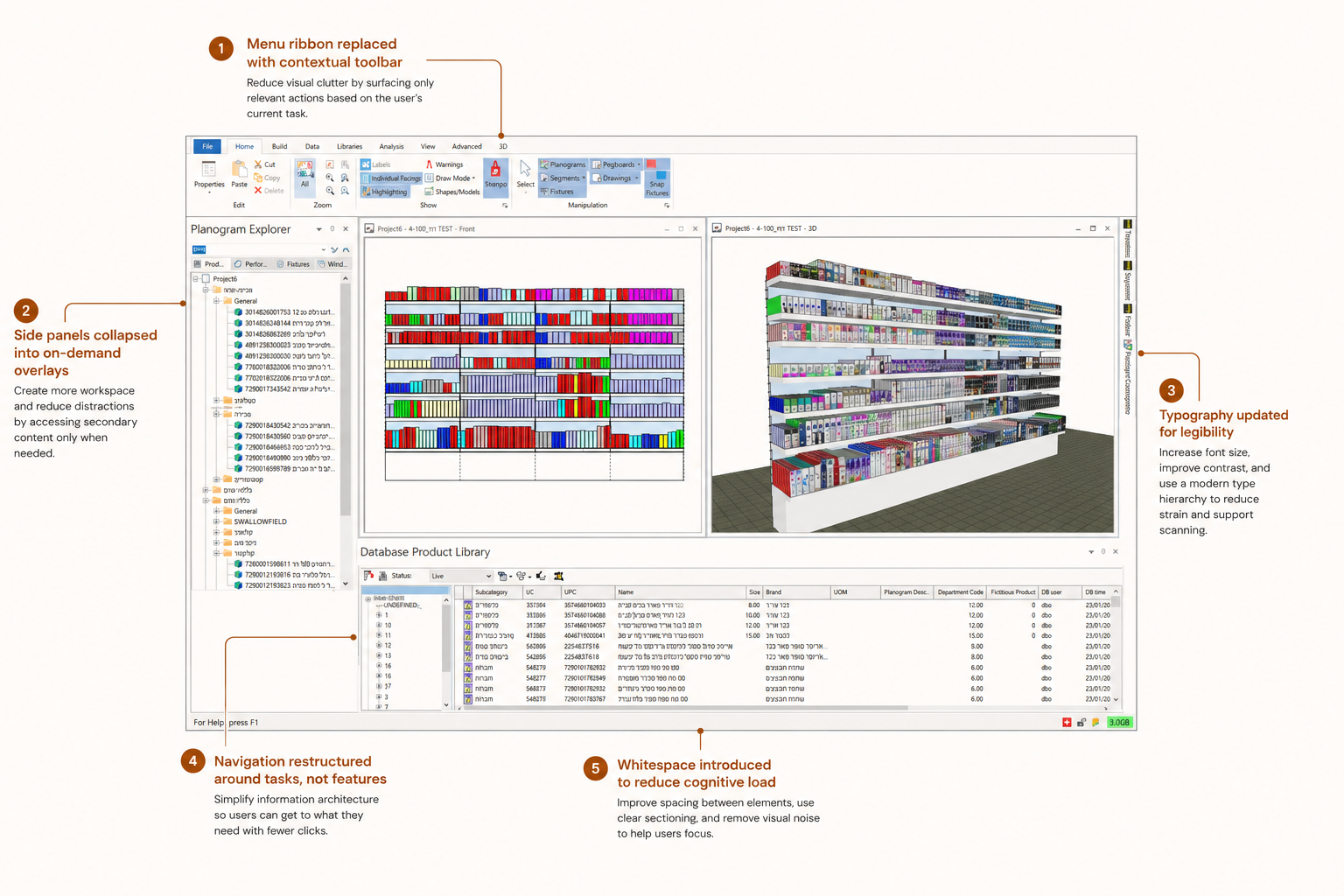
The most significant finding was that our core hypothesis was wrong.
So we decided to stop trying to preserve something users didn’t need preserved, and committed to the new direction.
Impact
Top five features in CA release, tracing directly to research.
The CA release included over ten features shaped by this research. These five have the clearest line back to what multiple participants said or a pattern that emerged in the data.
Feature 01
Bulk floor plan updates
Manually repeating the same changes across multiple plans was one of the biggest time costs.
Feature 02
In-tool collaboration
Comments, tagging, external tool integration to allow teams to communicate within the tool.
Feature 03
Toolbar customisation
Different users had different workflows and priorities.
Feature 04
Agentic tone of voice
Shaped in the ideation workshop, tested in Round 2. Most users preferred a more formal, concise agentic interaction.
Feature 05
Minimal UI with contextual guidance
A direct result of the hypothesis flip. Fewer visible actions, contextual help and agent assistance on demand.
What's next
What I’m still curious about now that it’s live.
I plan to run a usability study once CA customers have had time to actually use the product. Two things I want to know:
How people use the AI agents. We designed for agentic interaction but haven’t seen it in real use yet. I want to know whether people use the agents at all, what they ask, and where they trust or override the output.
Whether the new navigation sticks. We moved significantly away from what users knew. Round 2 testing was positive, but a prototype session and daily use in a real job are different things.
Reflections
Owning end-to-end, reducing stakeholder skepticism, and trusting the research.
This was the first time I owned something from scratch, from “we don’t know what to build” to “it’s live with customers.” Every other project had a defined product to evaluate or a direction to test, or involved only a few research phases.
What I didn’t expect was how much the stakeholder relationship shifted. The product and engineering teams were skeptical at the start and unsure what research would add. By the end, they were coming to me before decisions. That happened because the research kept being right, and I made sure they could see that at every stage.
“The research readouts helped, but hearing what users say and seeing our assumptions validated helped more. I like that we can confidently tie most of our decisions back to something we now know users want.”
What I’d do differently is set up the stakeholder cadence earlier. The delays at the start were avoidable, and starting earlier would have helped me keep research visible from the beginning rather than catching up.
:)